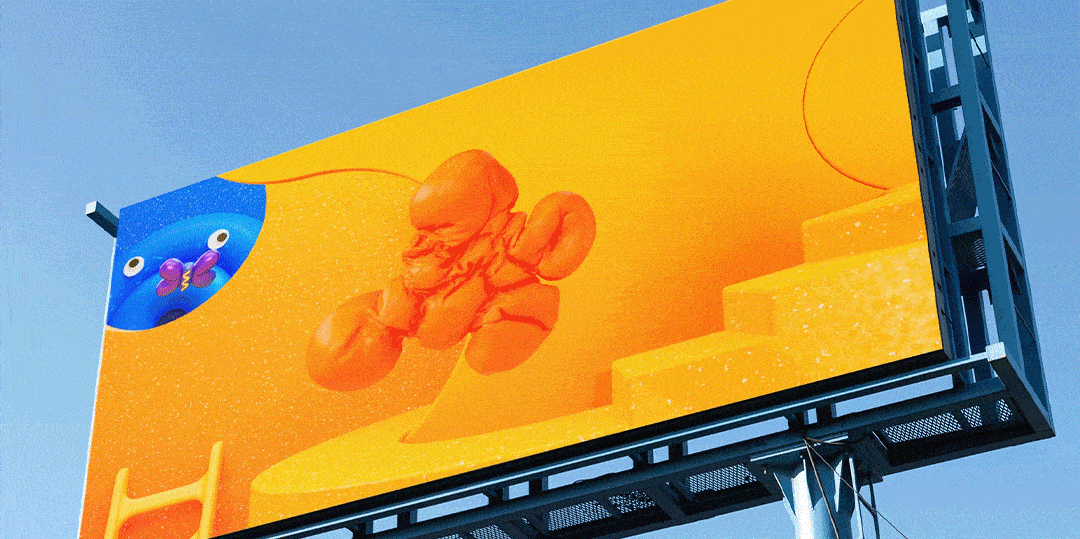
The visual identity blends traditional animation with modern 3D design, complemented by live-action IDs that showcase kids being their imaginative, messy selves. Collaborating with LA-based agency Roger, Nickelodeon ensured the rebrand remains cohesive across all platforms, staying true to the brand’s playful spirit.
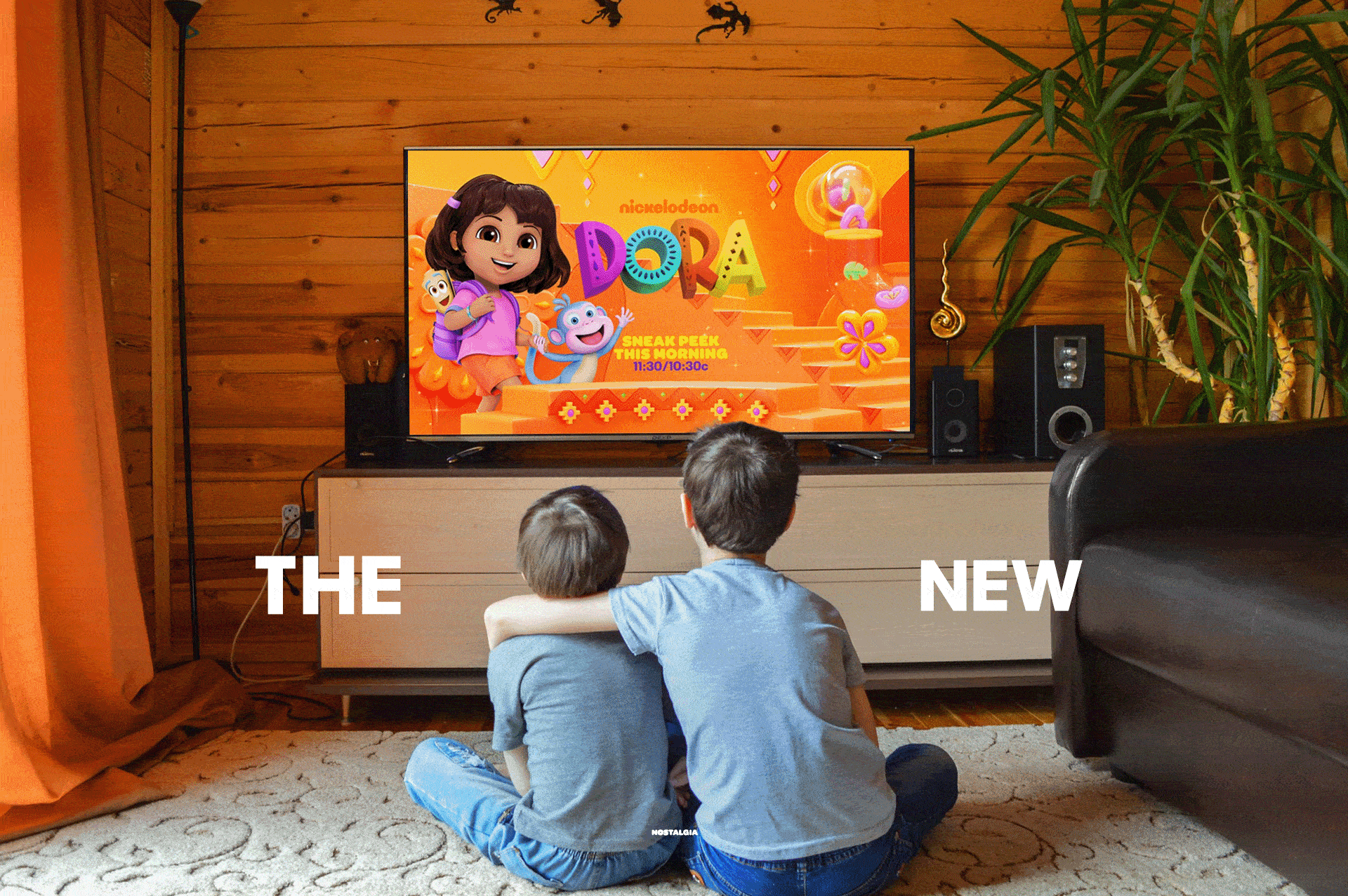
For Nick Jr., the goal was to create a fun, bright, and playful space that feels like a hands-on playroom. We explored fun materials and textures that would make preschoolers smile and feel exhilarated. This new play space is designed to be the ultimate destination that excites preschoolers, with a look that is bold, energetic, and inviting in surprising and imaginative ways. We also introduced slime into the Nick Jr. world—keeping it fun and silly, but without being too messy for the younger audience.